Senior Year
Still life
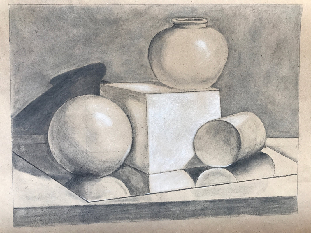
This charcoal still life of 4 objects on a mirror was a lot of fun to create. The composition copies a still life made by someone else. To accurately place the objects in my piece as the piece I was essentially copying, I used a grid and measured where each object would intersect with the grid. I then used a ruler for the straight lines and a compass for the circles. Willow charcoal was a great medium for this project because it is easy to erase and build value. I also used white charcoal for highlights that brought the piece to life. Parts of the grid that I started with are still apparent in the piece because the willow charcoal did not completely erase. In the future, I should make the grid lines softer so that they can easily be completely removed. One important lesson that I learned while making this piece is that objects are not defined by the lines that define their edges, but instead by the contrast between the value of the object and the value of the background. This meant that the circles that I drew for the circular shapes were not actually part the the objects, but instead part of the background. These lines simply indicated where the shape ended. I also found that the open end of the cylinder was not completely circular because it is not being observed from straight on. In order to create a slight oval, I drew a thick circle and rubbed away the inside of the circle on the top and bottom and the outside of the circle on either side. This meant that the space inside the circular outline was taller than it was wide.
Project 1: Tesselation
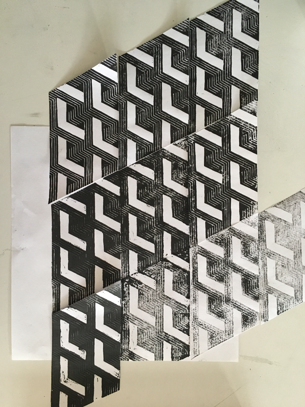
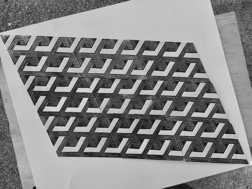
While exploring M.C. Esther's work, I discovered that many of his pieces are prints made from linocuts and woodcuts. This method of creating a detailed stamp fascinates me, so I decided to make one. One advantage of using a linocut is that it can be used to easily duplicate a detailed drawing. I came up with the idea of creating a linocut that would tesselate and create an endless pattern that I had worked with before. I began by experimenting with the pattern to figure out how I could create one linocut that would tesselate and could be printed over and over to create many identical smaller parts that could be place side by side so that the pattern would continue seamlessly. I figured out that a parrallelagram linocut would tellelate well and I sketched the pattern onto a parrellegram shaped area of a linoleum block. I then used a U-gouge to cut out the larger areas of the linocut and a V-gouge to cut out the smaller lines. Once I finished cutting the linoleum I began printing. After watching a few videos about the printing process I had a good idea about how printing works, and my first print actually looked good. However, the second print was much darker because the residual ink from the first print began to fill in the cuts, causing the linocut to print black where there should have been white. I also printed a few with less ink and ended up with prints that were "Sandy" and faded. I used all of these tellelating prints to create a gradient of the pattern that goes from too dark to just right and then to too faded. I like how the pattern continued fairly well, but plan on printing more so that I will have enough prints that look smooth and just right so that I can piece them together to create one larger piece where the pattern clearly continues and the contrast is high.
Stripes
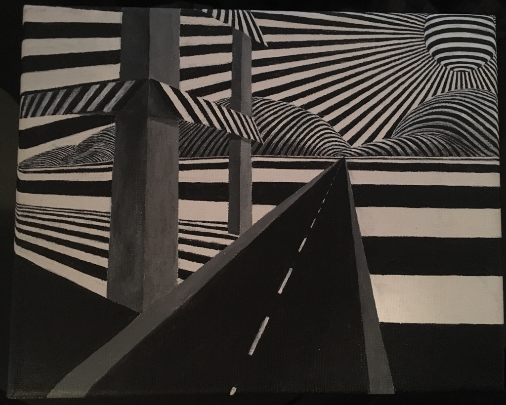
I began painting this canvas with a simple idea: paint a road that disappears into the distance with a building next to it. After accomplishing this preliminary goal, I began painting stripes next to the road that gradually became thinner until they too disappeared into the distance. The idea of something disappearing due to perspective interests me because I can create the illusion of reality by following this pattern. After painting the foreground first (amateur acrylic mistake), I began to ponder how I could fill in the background above the last horizontal stripe. Using the viewer's familiarity with the stripes, I figured that I could continue the theme of stripes, but distort them and make them far smaller to create the illusion of distance. I found a digital art piece which featured striped hills and I decided that hills would be the perfect background. First, I painted curved black hills so that I could then cover up part of the black with white stripes resulting in striped hills. I found that the hills looked best when the lines were equal in width and when they became sharper as they curved over the hill. I was able to paint curved lines with similar widths by working in one direction, sharping and perfecting the last line with the next alternating color. After finishing both hills, I decided that I could continue the theme of distance by painting smaller hills in the left side of the canvas, making it seem like the hills on the left are farther away than the ones at the end of the road. I used the same technique for these hills, but found it difficult to create lines as small I wanted. When I spread the bristles of my brush, I was able to pick up a tiny amount of paint and use a small cluster of bristles to paint the tiny stripes on the smaller hills. Next, I moved on the floor of the building. Still unsure about the purpose of the building, I decided that I could continue the stripe pattern on the floor of the building, but make the stripes thinner so that they would stand out from the other horizontal stripes. I found that I could continue painting over the edge of the canvas, onto the side, so I began continuing all the patterns onto the side of the canvas. This could be accomplished in unique ways, such as curving the lines over the edge, or attempting to keep them straight. Now that I had covered most of the canvas beside the top portion, I decided to paint a black circle as a sun. I then drew lines out from the center of the circle and painting stripes around the sun to look like rays of sunlight. These rays curved over the edge of canvas, but still looked as if they were straight lines. As the stripes passed behind the building, I made them bend slightly downward by drawing lines that were at a slightly different angle then the rays of sunlight that were not behind the building. I did this to create the illusion that the windows of the building were distorting the light.
Painting this striped world taught me how acrylic painting can be perfected by continuously covering up old paint to make it better resemble the world that I am attempting to create. Any mistakes can easily be corrected, and the potential to erase is limitless. Sharpening tiny lines using this method made it possible for me to create lines far smaller than I could simply paint in one stroke. Instead, when I inevitably paint a black line that is too thick, I can sharper the line with white paint until it is as thin as I want. If I were to do anything differently while painting, I would better plan the scene and begin by painting the background because it is easier to move from the background forward than from the foreground backwards when painting with acrylic.
Painting this striped world taught me how acrylic painting can be perfected by continuously covering up old paint to make it better resemble the world that I am attempting to create. Any mistakes can easily be corrected, and the potential to erase is limitless. Sharpening tiny lines using this method made it possible for me to create lines far smaller than I could simply paint in one stroke. Instead, when I inevitably paint a black line that is too thick, I can sharper the line with white paint until it is as thin as I want. If I were to do anything differently while painting, I would better plan the scene and begin by painting the background because it is easier to move from the background forward than from the foreground backwards when painting with acrylic.
Impossibilities 2
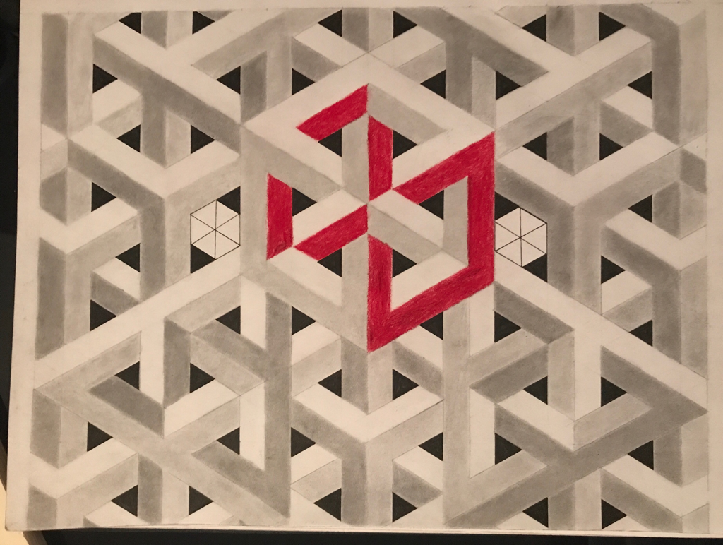
I began drawing this piece when I realized that the same grid pattern I have used to create impossible structures can be used to create a wide variety of interesting, often impossible shapes. To draw the grid, I draw verticals lines 1 cm apart, leaving a gap of 2 cm every third line. I then draw a line at a 30 degree angle to the original horizon and continue the pattern based on this line. Then, the intersections of these two series of lines reveal where a third series goes, one that is 30 degrees above the horizon, except on the other side of the verticals lines. Essentially, all the lines meet in the middle of hexagons, creating a pattern that can be purposefully erased to reveal 3D looking structures. I began by drawing the impossible cube that I found online and then continued to add a variety of other shapes such as impossible triangles, the goyard pattern, and a larger impossible triangle that encompasses 4 individual triangles. When I began shading the structures to bring them to life, I ran into problems because the structures are in fact impossible. This meant that thr lighting of the structures did not follow the same pattern throughout the piece, taking away from the harmony of the piece while also making it look more impossible.
Cube print
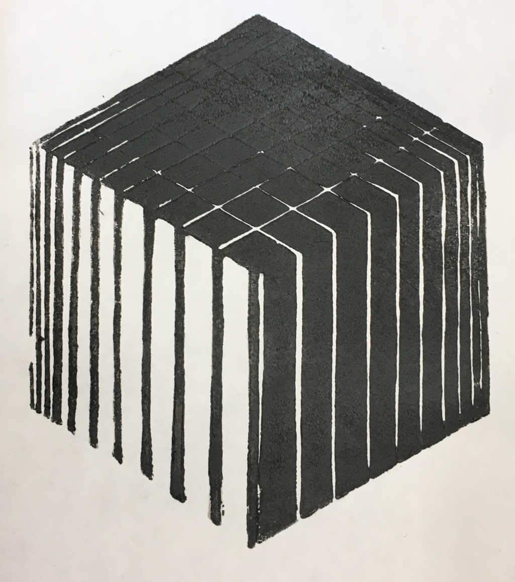
I began creating this print by cutting a hexagon out of a piece of linoleum. From a certain angle, a cube appears to look like a haxagon, so by shading each side of what would be a cube on my hexagon, I create the illusion of a 3D figure. On one side, I cut thin lines into the linoleum which resulted in the darker side on the bottom right of the print. Then, I cut out everything except for thin lines on the other side, resulting in the lighter left side. Next, I cut a grid on the top side to create the illusion of distance as the squares get smaller towards the top of the print. This piece attempts to use symmetry and pattern to create a composition which resembles a 3D cube with light and dark sides as shadows. On the left side of the print, there is a small gap in the thinnest line because I accidently cut this part away. I will have to be more careful to preserve small lines in the future, because they are very fragile. The top of the print also came out much darker than I intended because the small cuts quickly filled with ink, meaning that the grid lines go from white to small ridges of black, retaining the line and creating the illusion of a shadow. I like this effect, but also like some of the other prints because they preserve the white of the grid lines.
Checkered Cube
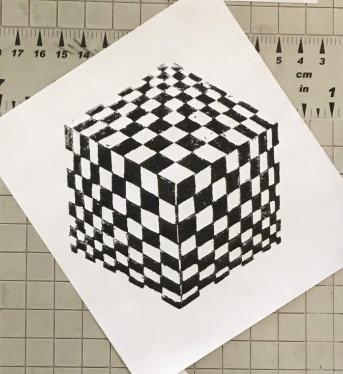
1. In this print, I did a good job of cutting out my linocut symmetrically, without making any large mistakes. Heating up the linoleum really helped cut it easily with more control. Additionally, the measurements I used to create the checkered pattern on each side of the cube do a good job of creating the illusion of a 3D object. I would like the prints to have come out a bit sharper, with less sandy texture, but overall I was very satisfied with how they came out. My prints are seldom perfect, and these were some of the best so far.
2. M.C. Escher inspired this piece. He creates illusions that pop right off the page, encouraging me to attempt to create a cube that would appear 3D. I am also inspired by the tiny details of his pieces because I do not understand how a linocut can create gradients and minuscule details. One of my goals when making this linocut was to incorporate this kind of detail, so I made the smallest of the checkered squares just a few millimeters wide, challenging my cutting abilities. Surprisingly, these details printed very well, showing me how anything is possible when printing from a linocut. Creating a gradient would simply require such small cuts that they are perceived as a smooth texture, rather than a pattern of high contrast dots.
3. I began making this piece knowing that I wanted to make another hexagon print that looks like a cube. I have noticed how checkered patterns are a great way of conveying distance and perspective, so I decided to make each side of the cube a checkered pattern that would get smaller as it moved toward the corner. In order to increase the contrast of the checkered squares, I cut a line in between the middle black squares, and left a small line in between the middle white squares. This line helps convey that there are three separate sides of the cube, making it look more 3D.
4. If I could do something over, I would take more time making the line in the middle of the bottom two sides of the cube. If I had used a straight edge to cut these small lines they would likely make the cube look even more 3D.
5. This piece highlights the importance of perspective because it appears 3D from one angle, when really it is a 2D piece of paper. Just as things looks smaller the further they are away, the checkered pattern gets smaller the further away from the center it is.
watercolor fog
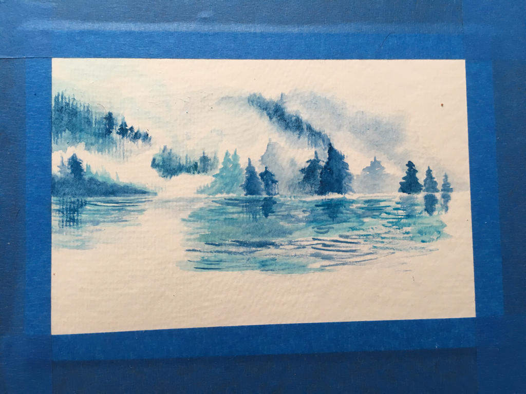
1. In this watercolor, I tried to smear the blend and use more water to create subtle faded colors. I did this in order to convey fog and the faded trees that can barely be seen through fog. I was fairly successful in this effort. However, I was less successful than I would have liked when I was painting the water. I used brush strokes that were too long, making the water look like one almost uniform texture rather than a textured surface that becomes smaller the further away it is.
2. I based this piece on a watercolor online that I found to be very pretty. I really liked how their clouds stood out by preserving the white of the paper. I also liked how smooth their water looked.
3. I began by painting the water line as a horizontal line and then some trees on this line. I made sure to preserve the white of the fog as I continued to paint more trees further off and the water.
4. I would take more time when painting the water, and build it up with many layers so that there would be a more unified, smooth texture with perspective.
3. The distance and perspective involved in the fog and trees link this piece to my theme of perspective. However, I could have done a better job conveying the perspective of the water.
watercolor plant
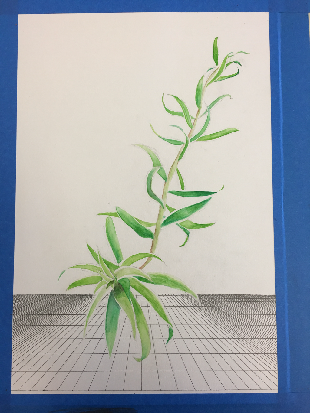
I began painting this piece with the goal of creating a watercolor of a picture of a plant I saw in Kauai. The picture of the plant really popped from its background and had interesting white boarders. I sketched an outline of the leafs of the plant and then painted each leaf using green, greenish-blue, and sometimes black paint for shadows. I also erased the pencil outline of each leaf before painting it so that there would not be a dark boarder. I was careful to preserve the white boarder of each leaf because white must stay white in a watercolor painting, there is no erasing. This helped make the leafs stand out from each other and appear brighter as though the sun is shining on them. The leafs become smaller the further up and away from the main part they are, creating the illusion of depth. To add to this perspective illusion I created a grid pattern that looks like a floor using a vanishing point. As the lines become closer to each other on the sides of the piece, the pattern appears darker, making the middle where the plant is look brighter. This helps center the focus on the plant. I made sure to erase the grid lines immediately around each plant so that it would appear as though there is a white boarder around each leaf. This also helped the plant pop from the background.
Most of the piece is white space, but I don't mind this. It could be nice to add something else in the background, but I don't want to take away from how the plant is the highlight of the piece.
Most of the piece is white space, but I don't mind this. It could be nice to add something else in the background, but I don't want to take away from how the plant is the highlight of the piece.
