Self Portrait
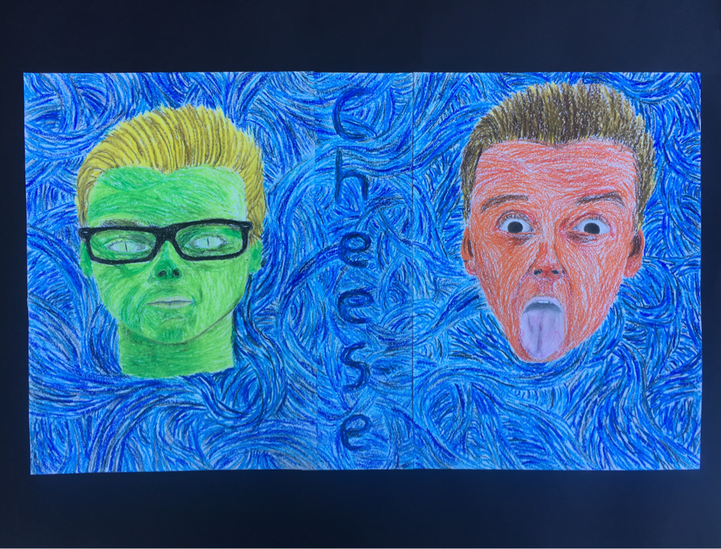
In my self portrait, I experimented with value to create shadows and dimension within my face. Using the color wheel, I chose a light and dark green for one face and a red and orange for the other. The contrast of the faces represents the two sides of my personality I have embraced lately.
I was inspired by two artists in particular while creating my self portrait. At first, Andy Warhol's colorful interpretation of Marylin Monroe's face inspired me because it popped. I sought to create simular contrast to his piece so that mine too could pop off the paper. I also took inspiration from Vincent Van Gogh's starry night. I love how his piece seems to move and flow, so I attempted to replicate it by repetivitily drawing lines flowing in many directions. This use of lines helped create a texture that can be seen throughout the piece.
I chose to write a big "cheese" across the middle of the piece to make my audience think about taking a picture and being told, "cheese". This would help them understand how I can switch personalities so easily, helping my audience better understand me as a person.
The critique of my self portrait helped me understand specific aspects of a face that I missed while drawing myself. For example, in my green face I missed some of the important aspects of eyes that make them appear real. Eyes and eyelids are full of shadows, so in the future I will incorporate these shadows to bring my eyes to life.
Collage
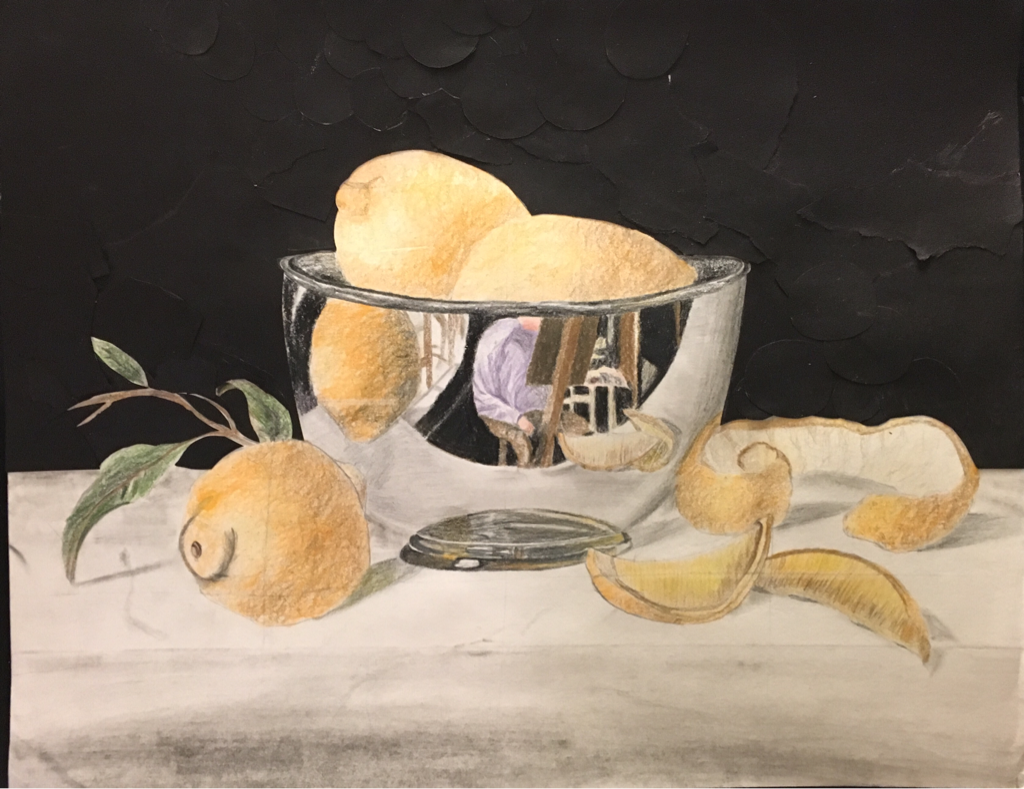
This feel good project was made using colored pencils, pencil, and black paper for the background. I began by coloring in the fruit because they are the highlight of the piece. I repetitively used a swirly pattern with orange and yellow colored pencils to produce a texture that somewhat looks like the bumpy texture of an orange. I then used the same swirly stroke to add shadows to the oranges with a brown colored pencil, giving them depth. I tired to use less color in the brightest areas of the oranges, so as to preserve the bright white of the paper. I then began working on the bowl, from the bottom up. I used a pencil along with some color from colored pencils to draw the base of bowl. I tried to preserve some of the white to look like the bright reflections on the bowl in my reference picture, but the sharp contrast between this white and the dark colors made the reflections stand out too much to look natural. In the future I will attempt to blend these reflective white areas more. As I began working on the reflection of the room in which the bowl is sitting, I focused on the artist's arm and the wrinkles on their sleeve. I gently rubbed my purple colored pencil all over the arm and then created wrinkles in the shirt by putting more pressure on the pencil in streaks. For the artist's blurred out face, I blended a red and a pink colored pencil by laying the colors and rubbing them against each other until the contrast between them was gone. Then I created the shadows of the oranges, bowl, and leaf using pencil lead and a blending stick. I scraped a few lines of pencil lead in the general shape of the shadow and then smeared it until there was no clear edge of the shadow and the lead was evenly distributed. I then wanted to add a black background like the original piece, but figured that it would be more interesting if the background had some texture. I tore and cut out pieces of black paper and glued them to the top half of the paper.
#2 Social Issue
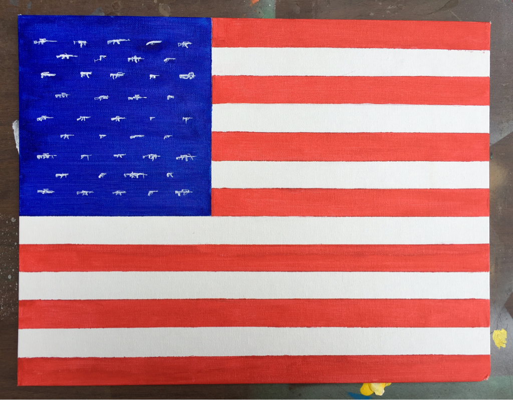
I made this piece to express some of my feelings about guns in the United States. I used tape to paint straight lines with acrylic paint to create an American flag. Then, instead of stars, I painted tiny little white guns. The detail of the guns required me to take my time and use very soft brush stokes where only the tip of the brush touches the canvas. The last gun took me much less time to paint than the first one meaning that I got better and better at painting detail with acrylic. I chose to paint guns instead of stars to symbolize how intertwined guns are in North American culture. The number and variety of guns in The United States amazes me. Every gun on the piece is a unique, real gun. If I were to do anything differently on this piece it would be to add more guns so that there would be 50 stars on the flag.
#3 Tribute
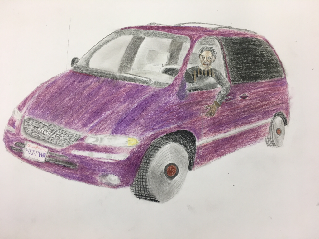
I made this piece to honor one of my favorite musical artists, Kendrick Lamar. I chose to feature him in the minivan that is on the cover of his album Good Kid M.A.A.D City. I began by sketching a picture of the same type of minivan as the one on the cover of the album that I found online. When I decided it was time to color the car in, i looked for a reddish purple colored pencil or pastel, but could not find one that looked similar enough to the color of the car. So, I made my own color. Through experimentation with purple and red colored pencils and pastels, I finally found that a base of red and purple colored pencil covered by smeared purple oil pastel looked somewhat like the color of the car. I filled in the car with my new color, making sure to add more purple in some areas to look like shadows and less purple in others to create depth within the car. After filling in the windows and some of the interior of the car, I got to work on the headlights. I used a blending stick to smear little areas of grey on the headlights, while also leaving much of the light untouched so that it would look bright. I created the grill of the car by making small black dashes with a colored pencil. The dashes are in a grid pattern to make it look like the area that I did not color black is the grey area of the grill. This came out looking alright, but in the future I will take the time to make each dash a rectangle with right angles so that the grill is more pronounced and there is a sharp contrast between the metal lattice and the black behind it. Then, I decided it was time to color in Kendrick. I practiced drawing his face on another paper until I was satisfied with the result. I used several shades of brown along with some black and a tan color to color in his face. I tired to use the darker browns in the areas of his face that would be shadowed, but found that the contrast between the browns made his face look unnatural. I realized that it would look better if I had blended the colors, but found it very awkward to blend colored pencil that was already cemented into the paper. I then drew his hair with a black colored pencil, using lots of little curved lines. I finished by adding the wheels, which are actually records. These records symbolize how Kendrick Lamar's music career had driven him where he wants to be.
#4 Still life
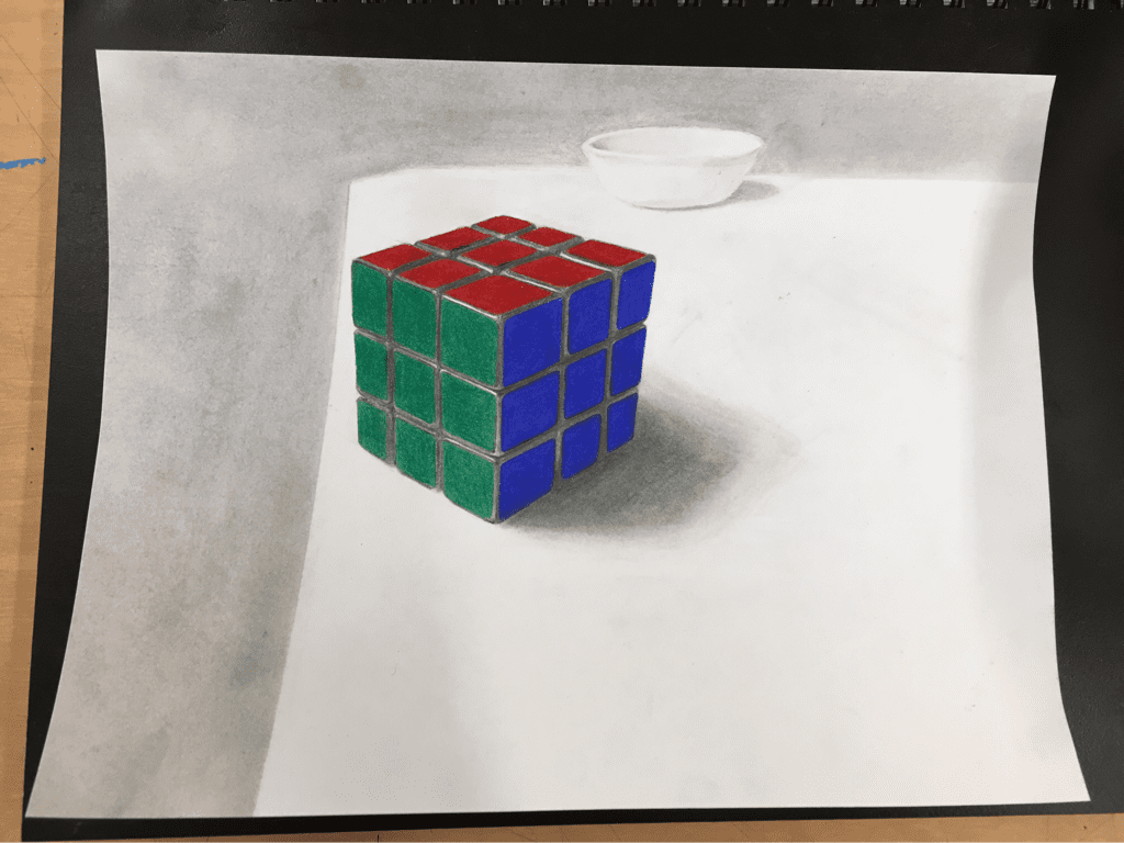
One day I attempted to draw the rubik's cube that was sitting in front of me on my desk. Once I completed a quick sketch and began to color in the many regions of the cube, I realized that it looked nothing like the real thing. So, I decided to take on a challenge of drawing a realistic looking rubik's cube. I started by finding a picture of a rubik's cube online so that I would have a reference from one perspective that I could use to figure out certain dimensions of a real cube. Then, as I sketched my new cube, I began to notice the flaws that had made my previous attempt look unrealistic. For example, I generally attempted to draw parallel lines in the first sketch when really the gaps between the lines become smaller the further away they are. Using the reference picture I sketched a cube with realistic looking dimensions and then got to work filling in the shadowed regions between each square on each side of the cube. Then came the challenge of coloring in each region of the cube. The sides of a rubik's cube have very pure colors with little contrast, so I decided to use colored pencils. Using plenty of pressure, I layered color onto each square until no white could be easily seen. I now had a realistic looking cube, but it was based on a studio lit image from an unpractical perspective. My new hallenge was to turn an object into a scene by creating a backround that would fit the perspective of the cube. To figure out what such a backround would look like, I took my cube, adjustable light, and a bowl into my kitchen and set up the scene. I kept taking pictures from slightly different perspectives until I got one that resembled the dimensions of the cube on my paper. I used this picture as a new reference for where I should place a bowl in the backround and where the line of the edge of the table should be. Using a blending stick and a tiny scrap of toilet paper, I created the shape of a bowl strictly from the shadows that it would cast. I then filled in the backround by blending pencil lead to the edge of the table and around the top half of the bowl so it would look like the bowl is sitting on top of the table. Finally, I added a shadow to the rubik's cube by repetitivly layering different shades of pencil lead in the shape I got from my picture. The unique perspective of the cube that I got from my first reference picture ended up shaping the placement of every element within my scence. This helped me understand the importance of persective when attemping to create a scene.
#5 charcoal self portrait
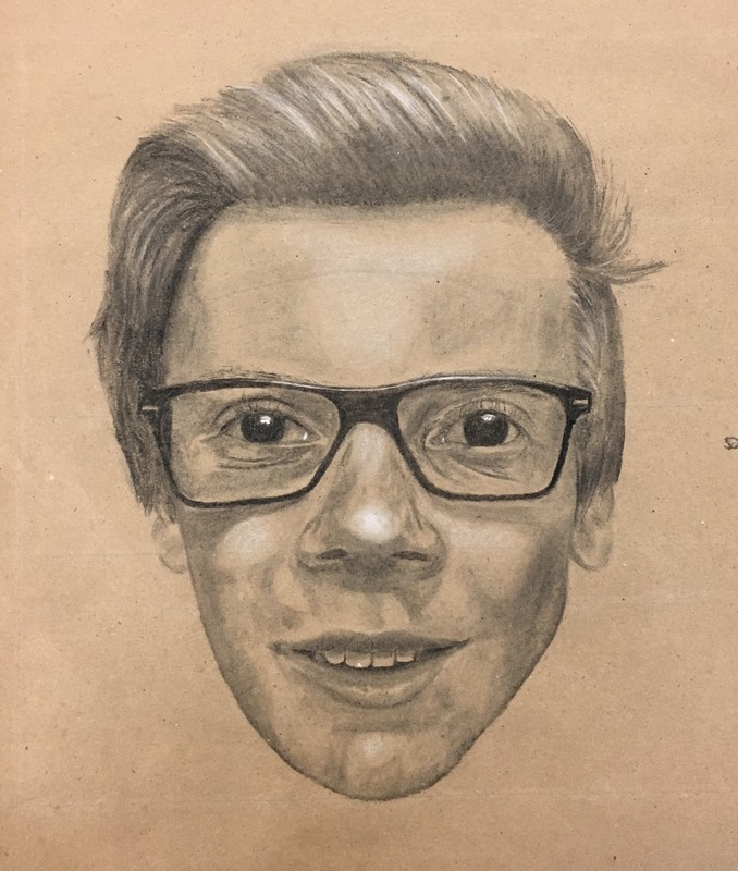
This self portrait was made using willow charcoal and white charcoal. I began by taking a staight on picture of myself and printing it out. Then I drew a grid on the picture and a grid that was twice as large on a brown sheet of paper. I began by sketching my glasses until they fit the dimensions of my picture. Then, I began working on the eyes. It took a few attempts, changing the shape of my eyes each time, to end up with two eyes that actually look similar to mine. I then used the glasses as a reference as I filled in the rest of my face, blending the charcoal along the way. Once I was satisfied with all my facial features, I began adding white highlights that brought my portrait to life. I had to be very careful when adding the white highlights to my eyes because any error in the placement of these highlights stuck out like a sore thumb. Finally, I added the hair using a repetitive curved stroke, leaving part of it black so that I could add white highlights. I finished by smearing a little charcoal in the shape of earloabs. This project taught me how important eyes are when it comes to replicating a face. Very subtle differences in value and shape comprise the differences between unique pairs of eyes.
#6 perspective
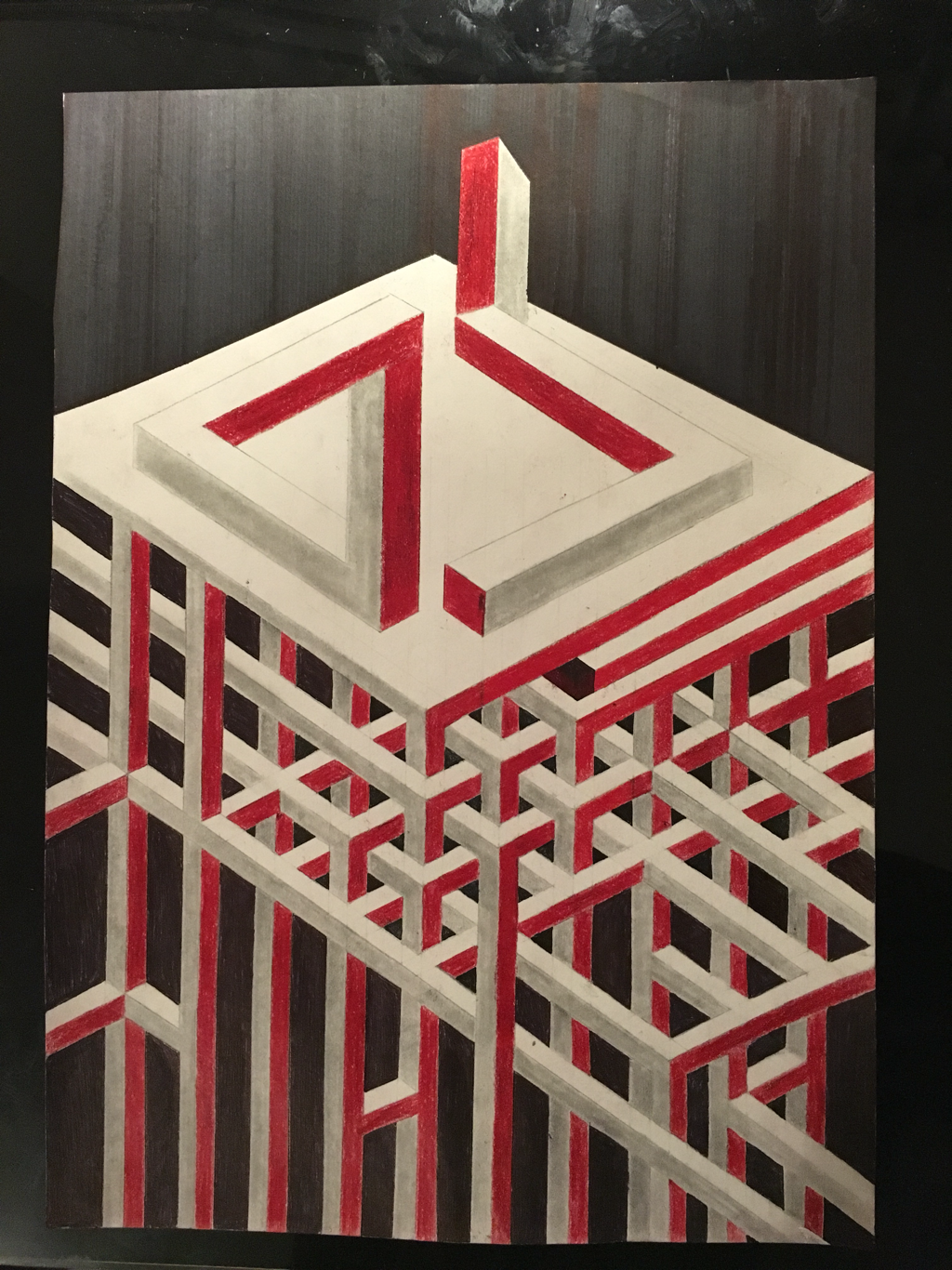
I began sketching this project in the middle of the paper attempting to duplicate a design I had seen before. I made the pattern by drawing parallel lines vericaly and then then at two diagonals. I then erased most of the lines that intersected, leaving the outline of a meeting point of pillars. I used the parallel lines that extended out to show me where the pillar should extend. After extending certain pillars, I joined a few in a way that looks impossible based on where the pillars attach to other pillars. I was inspired to make certain impossible looking pillars after seeing M. C. Escher's work with impossible looking structures. I created a rhythm by always using red colored pencil to color in the right side of the pillars and blended pencil on the left side of the pillars. After seeing how certain parts of the pillars looked impossible, I recalled a cool, impossible looking triangle and decided it belingned in my piece. To highlight the importance of perspective, I decided to show how an image of this impossible looking triangle could actually be created by looking at the shape I drew on the right from a certain perspective. By drawing the two shapes next to each other, I create a juxtaposition between what the 3D shape would look like from two different perspectives. To highlight difference between these perspectives, I decided not to follow the rhythm of colors that I created in the pillars below. Instead I colored the right side grey and the left red to draw the audience's attention to the alternate perspective of the impossible triangle.
#7 Penrose triangle
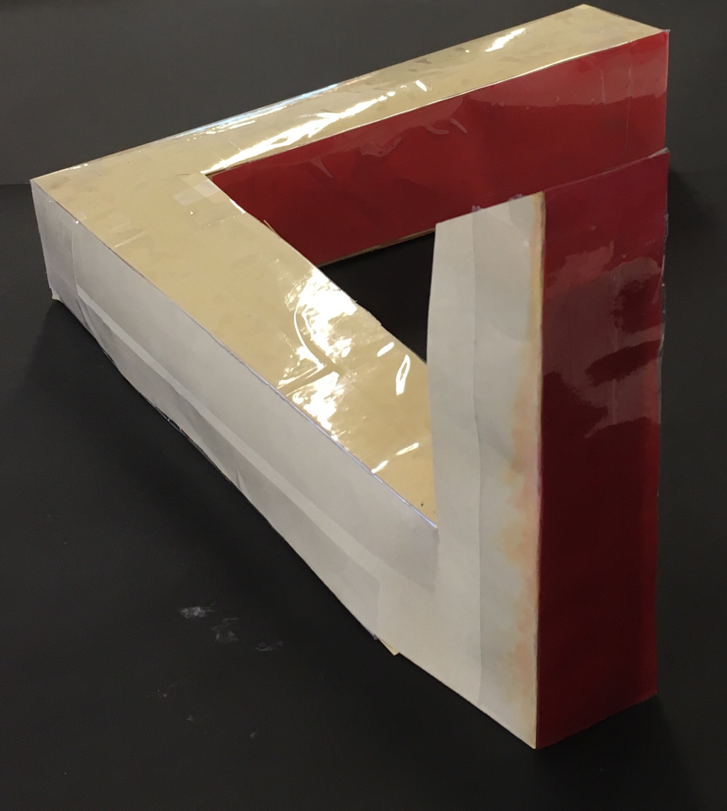
I made this piece to highlight the power of perspective. Only from one perspective, the one featured above, does the piece look like a Penrose triangle. I began working on this piece by cutting out the general shapes in paper and taping them together. At first, it never looked the way I wanted because the dimensions were off. This meant that the leg sticking up did not blend in with the leg going off into the background. To fix this, I adjeustd the height and size of the leg sticking up so that it fit in with the other legs. However, the leg sticking up still appeared larger than the other legs when I took a picture of the piece. This was because objects appear smaller the farther away they are. So, I decided to make the leg going off into the background become larger the further away it is. I accomplished this by cutting out pieces of paper that were taller on one side than the other. I used these prices to elevate the leg going off into the backround at a slope that made the leg appear to be the same size all over even though it was actually larger on one side. One of my main goals with this piece was to clarify what I drew in my previous piece. I plan to color my penrose triangle according to to how it is colored in my previous illusion piece so that my audience will be able to see how they are the same object, just presented from different perspectives.
#8 childhood to adulthood
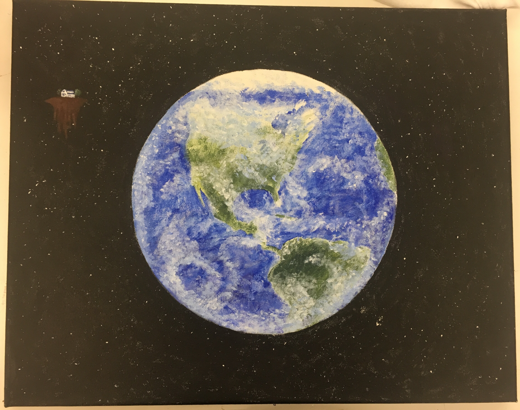
While brainstorming my childhood to adulthood piece, I decided that being an active member of the world is my perspective of what it means to be an adult. I wanted to present the world as both huge and beautiful, so I deduced to paint it with acrylic. I began by drawing a circle in the middle of my canvas with a compass. I painted the backround black by slowly adding faint layers of black paint. This technique allowed me to save some of the white backround of the rough canvas, which needed up looking like clusters of stars in the distance. Then, to add the larger stars, I dipped a paintbrush in a little water to dampen it and then flicked white paint all over the backround by bending the bristles of the Utah back and letting them go. This created a variety of star sizes, making the stars look more realistic. This technique also ended up creating small lines and streaks that I went over with black paint. To begin painting the Earth, I sketched a few continents and filled in the oceans with blue paint. I spread the blue unevenly, using a circular brush stroke. This created depth within the water that helped it better look like the actual ocean. I then added green in the continents using the same technique to create value. Next, I added clouds by mixing some blue into white paint and dabbing it around in clusters. I added pure white on top of the blue white mixture to create highlights that simulate clouds. To smooth and blotchy texture of the clouds that I created, I rubbed a little bit of water in a circular motion. This both blended and removed some of the paint, helping my clouds look diverse and realistic. To finish the piece, I added a small floating island in the top left corner. I painted a tiny version of my house on the island to symbolize how my house has isolated me from the world as a child. I chose to make my house very small to make the Earth stand out and look larger by comparison. This piece represents the journey that I will eventually take from my isolated house into the real world.
